Color Contrast: Bold Combinations for Striking Decor
Understanding Color Contrast in Interior Design
Color contrast is the art of pairing colors that differ significantly in hue or brightness. By using contrasting colors, you can create a dynamic space that draws the eye and evokes emotion. For instance, a room painted in soft pastels can be instantly energized with bold accents like a bright yellow sofa or deep blue artwork.
Color is the keyboard, the eyes are the harmonies, the soul is the piano with many strings.
In interior design, color contrast isn’t just about aesthetics; it also affects the mood of a room. Bright colors can create a lively atmosphere, while darker shades can add depth and sophistication. Think of a cozy reading nook with a dark green wall contrasted by a light-colored bookshelf; it creates a warm and inviting space that feels both intimate and stylish.
When planning your decor, consider the color wheel. Colors opposite each other, like blue and orange, create the strongest contrast. This principle can guide you in selecting bold combinations that will make your space pop while maintaining a sense of harmony.
Choosing Bold Color Combinations
When it comes to bold combinations, the key is to select colors that resonate with your personal style. For example, pairing a vibrant fuchsia with a deep teal can create a striking focal point in any room. This kind of combination works well in spaces like living rooms or dining areas where you want to make a memorable impact.
Another great pairing is the classic black and white, which offers a timeless elegance. While it may seem simple, adding a splash of a bright color, such as a sunny yellow or rich red, can elevate the look to something truly unique. Think of a white kitchen with black cabinets offset by colorful dishware; it keeps things fresh and lively.
Don't shy away from experimenting with unexpected combinations. For instance, combining earthy tones like terracotta with bright, tropical hues can create a warm yet vibrant atmosphere. This approach not only reflects your personality but also encourages creativity in your decor.
Using Color Contrast to Define Spaces
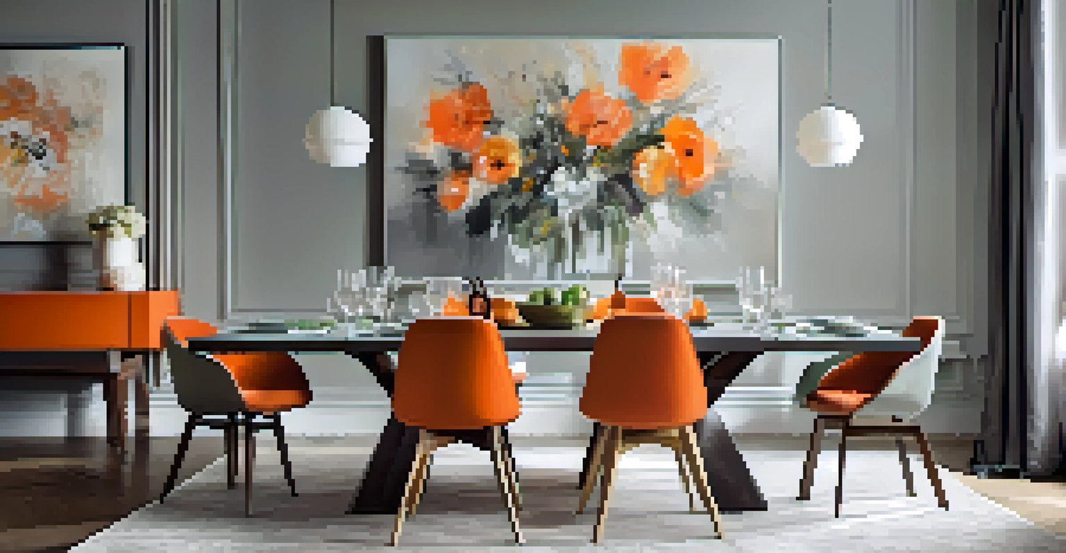
Color contrast can be a powerful tool for defining different areas within an open floor plan. By using contrasting colors in various zones, you can create a sense of separation without the need for physical barriers. For example, a living area painted in a soft gray can seamlessly blend with a vibrant orange dining space, creating distinct yet cohesive environments.
The best color in the whole world is the one that looks good on you.
In addition to defining spaces, color contrast can also help guide the flow of movement within a home. Imagine walking from a calm blue hallway into a bold red kitchen; the transition can evoke different feelings and energies, enhancing your overall experience in the space. This thoughtful approach encourages exploration and interaction.
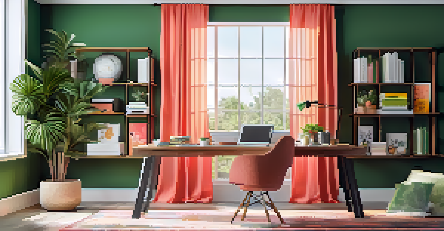
Utilizing color contrast for zoning is especially effective in multifunctional spaces like a home office. A soft green backdrop can create a serene atmosphere, while a bright coral accent wall can signify creativity and productivity. This technique not only enhances functionality but also adds visual interest.
Embracing Nature’s Palette for Bold Contrast
Nature provides the most beautiful examples of color contrast, and you can bring that inspiration into your decor. Think of the vibrant greens of foliage against the deep blues of the sky or the warm oranges and reds of a sunset. Incorporating these colors into your home can create a harmonious yet bold environment that feels connected to the natural world.
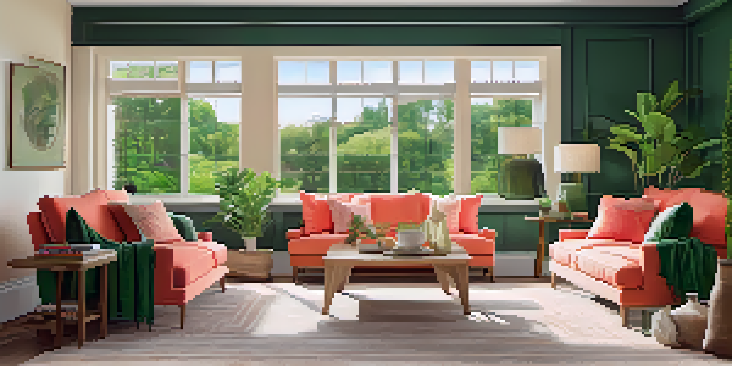
For instance, you could use a deep forest green as a backdrop in your living room and accent it with bright coral cushions and earthy wooden furniture. This combination not only feels fresh but also promotes a sense of calm and balance. Nature-inspired decor can be both invigorating and soothing.
Additionally, consider incorporating plants into your decor to enhance these color contrasts. A simple green plant can pop against a bold, colorful wall, adding life and texture to the space. The interplay between natural elements and bright colors can lead to a stunning aesthetic.
Accent Walls: A Bold Statement with Contrast
Accent walls are a fantastic way to introduce bold color combinations without overwhelming a room. By painting one wall in a striking color, you can create a focal point that draws the eye and adds depth to the space. For instance, a rich navy wall paired with light gray furniture can create a sophisticated yet inviting atmosphere.
Another popular choice for accent walls is using wallpaper with bold patterns. Floral prints in vibrant colors or geometric designs can bring life to a room, especially when contrasted with solid-colored furnishings. This approach allows for creativity while still maintaining a cohesive look throughout the space.
When selecting an accent wall color, consider how it complements the existing colors in your decor. A bright yellow wall can liven up a neutral room, while a dark charcoal wall can add a dramatic touch. The key is to ensure that the accent wall enhances the overall aesthetic rather than competing with it.
Accessorizing with Color Contrast
Accessories are a simple yet effective way to incorporate bold color contrasts into your decor. Think about adding colorful throw pillows, vibrant rugs, or striking artwork to enhance the existing color scheme of your room. For example, a neutral sofa can come to life with a mix of colorful cushions in various textures and patterns.
Art pieces can also serve as a focal point, especially if they feature bold colors that contrast with your walls. A bright abstract painting can add energy to a subdued space, inviting conversation and interest. The beauty of accessorizing is that it allows for flexibility; you can easily swap items out to refresh your decor.
Don’t forget about lighting as well! Colorful lamps or unique light fixtures can add a touch of personality and contrast to your room. A bright pendant light can transform an otherwise muted dining area into a lively gathering space, showcasing the importance of thoughtful accessory choices.
Tips for Achieving Balanced Color Contrast
Achieving a balanced color contrast involves understanding both your space and your personal style. Start by selecting a base color that resonates with you, then choose one or two contrasting colors to complement it. For instance, if you love a soft beige, you might pair it with deep teal and bright coral for a balanced yet vibrant look.
Another tip is to use the 60-30-10 rule in your decor. This means using 60% of your dominant color, 30% of a secondary color, and 10% for accents. This approach ensures that your space feels cohesive while still allowing for bold contrasts. It’s a simple formula that can make a significant difference.
Finally, always consider the lighting in your space. Natural light can change how colors appear, so test your color combinations in different lighting conditions before finalizing your choices. This extra step can help you achieve that striking decor you’re aiming for, ensuring your bold combinations truly shine.