Choosing the Right Color Palette for Your Renovations
Understanding the Basics of Color Theory in Design
Color theory is the foundation of any successful design project. It helps you understand how colors interact, how they affect mood, and how they can enhance or detract from your space. For instance, warm colors like reds and yellows evoke energy and warmth, while cool colors such as blues and greens can create a calming atmosphere.
Color is the keyboard, the eyes are the harmonies, the soul is the piano with many strings.
To make the most of your renovations, familiarize yourself with the color wheel. This tool can guide you in selecting complementary colors that work well together. For example, pairing blue with orange can create a vibrant, eye-catching look, while using shades of the same color can create a more harmonious feel.
Understanding color theory not only aids in aesthetics but also helps in making informed decisions that reflect your personal style. By applying these principles, you can ensure that your renovations resonate with the desired mood and functionality of each space.
Considering the Purpose of Each Room
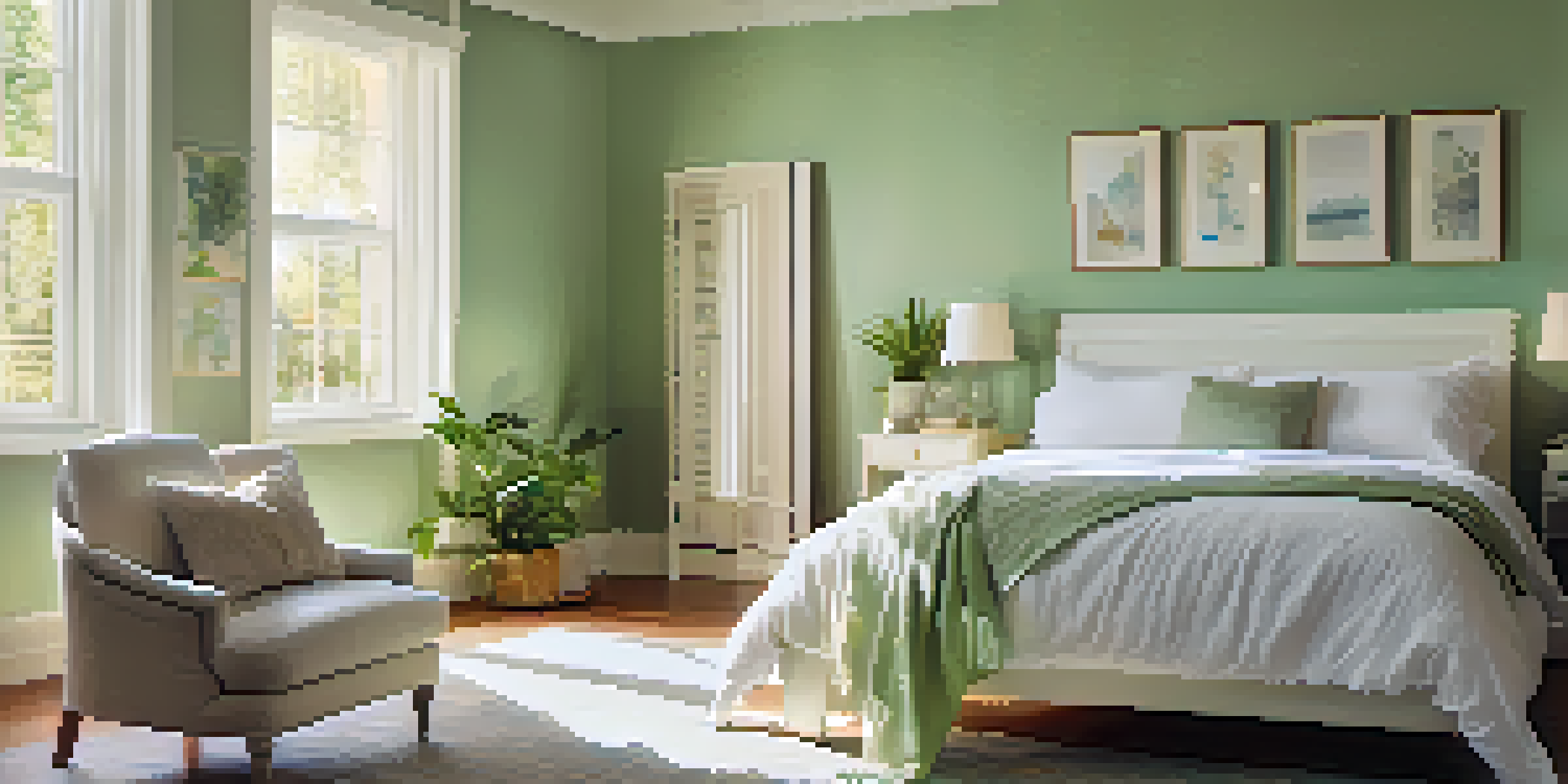
Every room in your home serves a unique purpose, and that should influence your color choices. For example, a bedroom might benefit from soothing colors to promote relaxation, while a home office might thrive with invigorating tones to boost productivity. Think about how you want each space to feel and function.
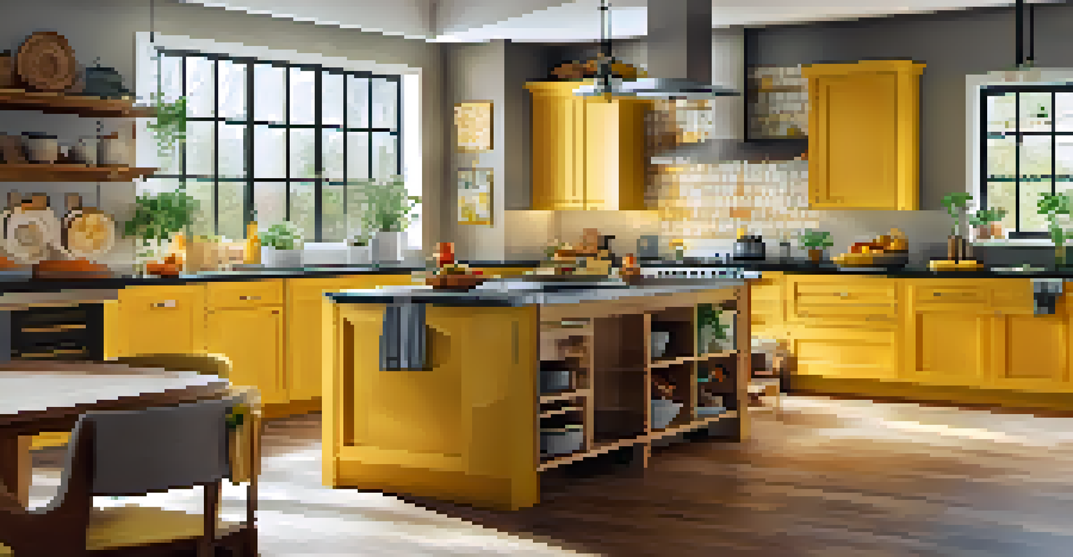
When selecting colors, visualize how the room will be used. A kitchen, where family gatherings often occur, may call for warm hues that encourage social interaction. In contrast, a bathroom might be best suited for cool, serene shades that evoke a spa-like atmosphere.
Understand Color Theory Basics
Familiarizing yourself with color theory helps you select colors that enhance mood and functionality in your design.
Taking the purpose of each room into account can simplify the color selection process. By aligning your color palette with the intended use of each area, you can create spaces that not only look good but also enhance your daily life.
Finding Inspiration in Nature and Surroundings
Nature is a fantastic source of inspiration when it comes to choosing a color palette. The colors found in landscapes, flowers, and even the sky can spark ideas for your home renovations. For instance, the calming greens of a forest or the vibrant colors of a sunset can guide your choices in a way that feels organic and refreshing.
Colors are the smiles of nature.
You can also draw inspiration from your home’s surroundings. If your house is near the ocean, consider incorporating soft blues and sandy beiges that reflect the coastal vibe. Similarly, if you live in a mountainous area, earthy tones might resonate more with your environment.
By connecting your color palette to the natural world, you can create a cohesive and inviting atmosphere in your home. This approach not only beautifies your space but also ensures that it feels harmonious with its environment.
Exploring Color Psychology and Its Effects
Color psychology is the study of how colors influence emotions and behavior. Understanding this can be powerful in creating spaces that evoke the right feelings. For example, yellow is often associated with happiness and energy, making it a great choice for a playroom or kitchen, while blue can foster tranquility, ideal for a bedroom or reading nook.
When renovating, consider how you want each room to feel. If you want a lively atmosphere, opt for vibrant hues. Alternatively, if you're aiming for a serene retreat, softer or muted tones might be more appropriate.
Purpose-Driven Color Choices
Aligning your color palette with the purpose of each room simplifies the selection process and enhances your living experience.
Using color psychology thoughtfully can transform your home into a space that not only looks appealing but also feels right for you and your family. By harnessing the emotional power of color, you can create an environment that supports your lifestyle.
Creating a Cohesive Color Scheme Throughout Your Space
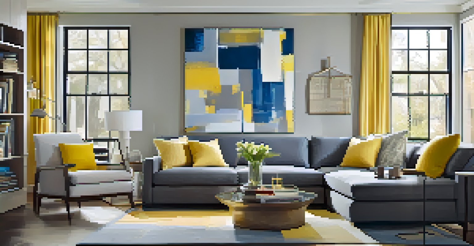
A cohesive color scheme can unify your home, making it feel more harmonious. While it’s essential for each room to reflect its unique purpose, a consistent palette can create a sense of flow. For instance, using a similar color family throughout the house can help different areas feel connected.
Start by selecting a primary color that resonates with you. Then, choose complementary and accent colors that can be used in different rooms. This approach allows for variety while maintaining a cohesive look. For example, if you choose a soft gray as your primary color, you might use different shades of gray along with pops of yellow and blue in various rooms.
By establishing a cohesive color scheme, you can create a beautiful, interconnected space that feels thoughtfully designed. This strategy ensures that each room complements the others, resulting in a more inviting and enjoyable atmosphere.
Testing Colors Before Committing to a Palette
Before you dive into painting or decorating, it’s wise to test your chosen colors. Paint small swatches on the walls or use color samples to see how they look in different lighting throughout the day. This step helps you visualize the final outcome and prevents costly mistakes.
Consider the effects of natural and artificial light on your selected colors. A hue that looks stunning in daylight might appear entirely different under incandescent lights. Testing allows you to observe these changes, ensuring that your final choice aligns with your vision.
Test Colors Before Finalizing
Testing colors in different lighting ensures that your final choices match your vision and prevents costly mistakes.
Taking the time to test colors can save you from buyer's remorse later on. It provides an opportunity to see how different shades interact with your furniture and decor, ultimately leading to a more satisfying renovation.
Incorporating Trends While Staying True to Your Style
Trends can be exciting, but it’s essential to incorporate them thoughtfully into your renovations. While it’s tempting to jump on the latest color craze, consider how it fits with your overall style and the long-term vision for your home. For example, if earthy tones are trending but you prefer bright colors, find a way to blend both.
You might choose a trendy color for an accent wall, while keeping the larger areas more neutral. This allows you to stay current without overwhelming your personal aesthetic. Additionally, trends often evolve, so using them sparingly can help your home feel timeless.
By striking a balance between trendy and personal, you can create a space that feels both fresh and uniquely yours. This approach ensures that your renovations reflect your personality while still embracing current design movements.
Finalizing Your Color Palette for Lasting Impact
Once you’ve navigated the world of color selection, it’s time to finalize your palette. Take all your insights—from color theory to personal preferences—and consolidate them into a cohesive plan. Write down your chosen colors and their intended uses in each room to keep your vision clear.
Don’t forget to consider the materials and textures in your space as well. Different materials can change how a color appears, so factor this into your final decisions. For example, a matte finish may soften a bold color, while a glossy surface can intensify it.
Finalizing your color palette is an exciting step in the renovation process. With a well-thought-out plan, you can transform your home into a space that reflects your style, enhances your living experience, and stands the test of time.