Outdoor Color Schemes: Trending Palettes for Spaces
Why Outdoor Color Schemes Matter for Your Space
Outdoor color schemes play a crucial role in setting the mood of your space. They can transform a simple patio into an inviting retreat or a dull garden into a vibrant sanctuary. By choosing the right colors, you can create a cohesive look that reflects your personal style and enhances the natural beauty of your surroundings.
Color is the keyboard, the eyes are the harmonies, the soul is the piano with many strings.
Think of color as the personality of your outdoor area. Just like in fashion, where the right palette can elevate an outfit, the right hues can elevate your outdoor experience. A thoughtfully selected color scheme can invite relaxation, encourage socializing, or even energize your family gatherings.
Additionally, colors can influence how we perceive temperature and space. For instance, lighter colors can make an area feel more expansive and airy, while darker shades can create a cozy, intimate atmosphere. Understanding these effects can help you make informed choices for your outdoor design.
Trending Color Palettes for 2023
As we step into 2023, several color palettes are emerging as favorites among designers and homeowners alike. Earthy tones like terracotta and olive green are making a strong comeback, reflecting a desire to connect with nature. These colors not only bring warmth but also seamlessly blend with natural elements, creating a harmonious outdoor environment.
Another popular trend this year is the use of bold, vibrant colors like coral and teal. These shades add a playful touch and can energize any outdoor space. Whether it's through statement furniture or accent décor, incorporating these lively colors can create focal points that draw the eye and spark conversation.
Color Sets the Mood Outdoors
Choosing the right outdoor color scheme can transform your space, making it inviting, energetic, or serene.
Lastly, neutral palettes with soft whites, grays, and beiges remain timeless. They provide a calm backdrop that allows plants and other features to shine. This versatile approach makes it easy to switch up accessories and seasonal decorations without a complete overhaul.
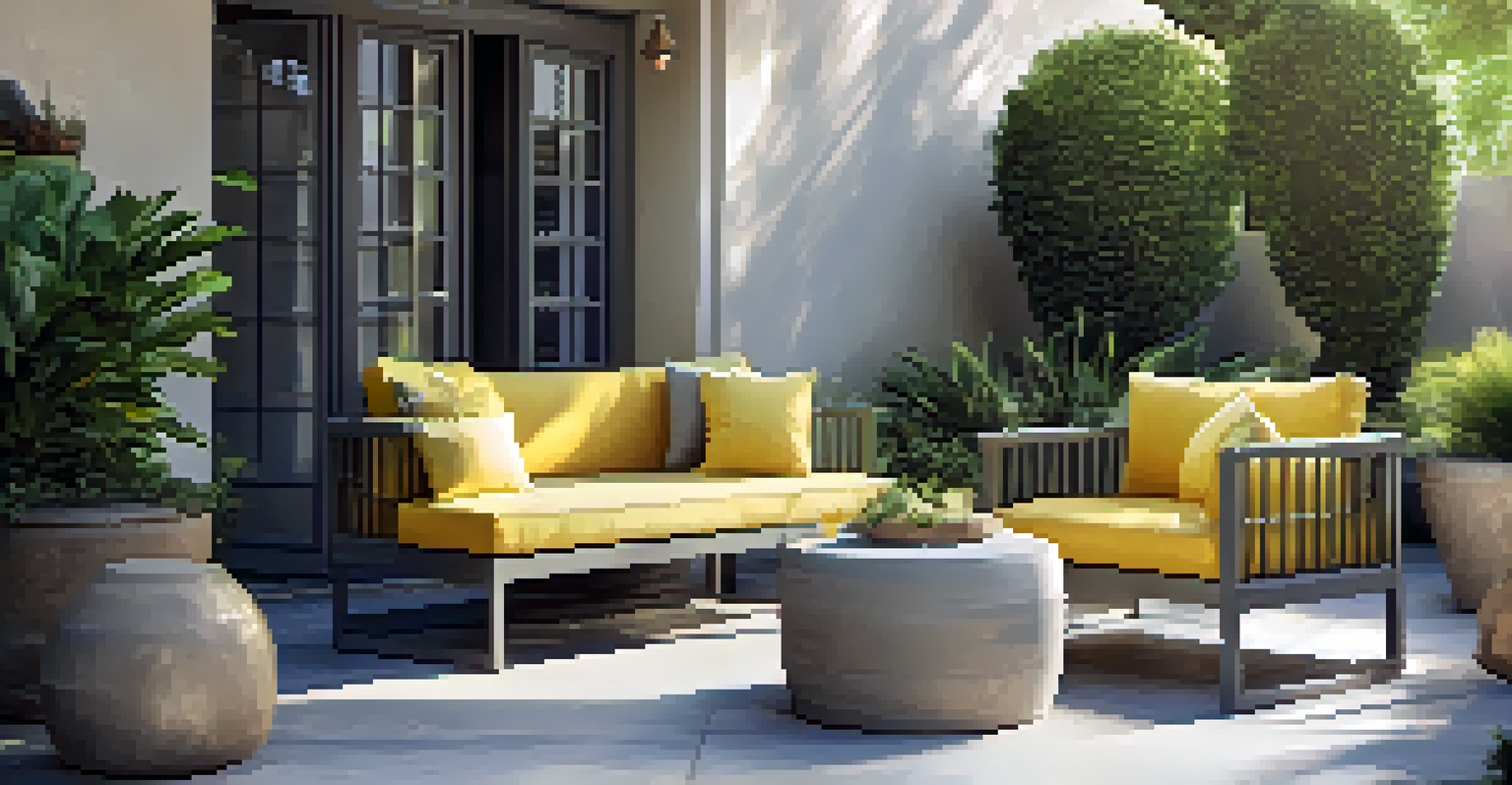
Combining Neutrals with Bold Accents
One effective way to approach outdoor design is by combining neutral tones with bold accents. This technique allows for a grounded, sophisticated look while infusing energy and personality through vibrant pops of color. For example, a soft gray patio paired with bright yellow cushions can create an inviting and cheerful atmosphere.
The best color in the whole world is the one that looks good on you.
This strategy is beneficial because it offers flexibility. As trends change or your tastes evolve, you can easily refresh the space. Simply swapping out accent pieces like pillows or outdoor rugs can dramatically alter the overall feel without needing a complete redesign.
Moreover, this combination works well to balance the visual weight of your space. Neutrals help create a calming effect, while bold colors can highlight specific areas, such as seating or dining spots. This balance ensures that your outdoor area remains inviting and engaging.
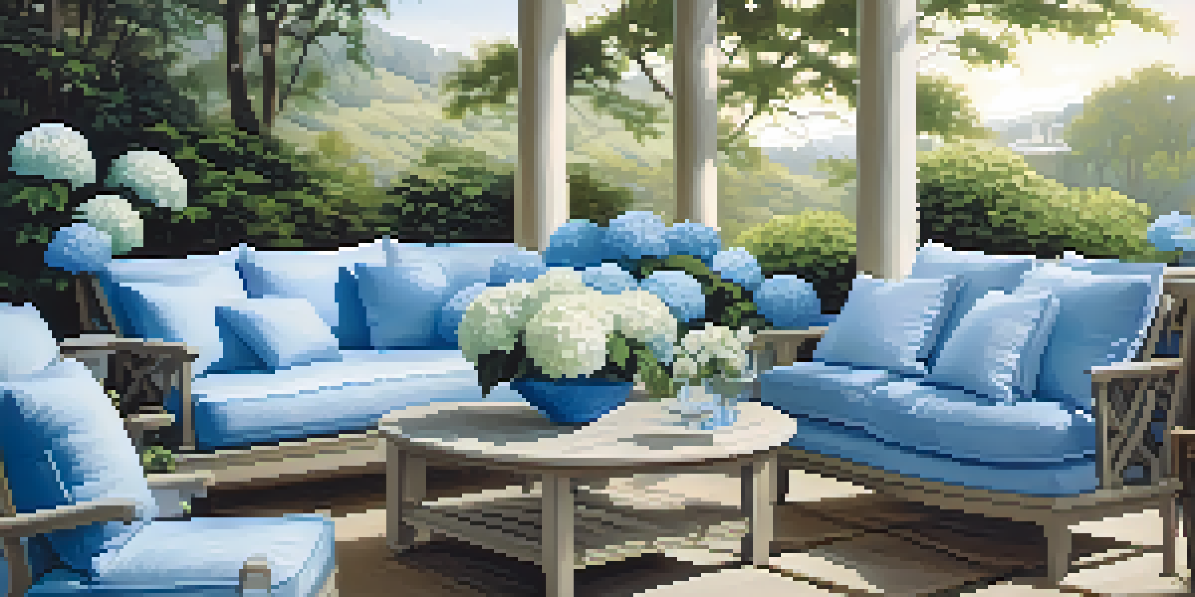
The Power of Monochromatic Schemes
Monochromatic color schemes, which use variations of a single color, can create a stunning and cohesive outdoor space. This approach allows you to explore different shades and textures within one color family, resulting in a sophisticated look. For example, different shades of blue can evoke the serenity of the ocean, perfect for a calming retreat.
Using a monochromatic palette can also simplify the design process. By focusing on one color, you can easily select furnishings and decorations that complement each other. This creates a harmonious flow, making your outdoor area feel more cohesive and intentional.
Trendy Palettes for 2023
This year features earthy tones, vibrant colors, and timeless neutrals that enhance outdoor aesthetics.
Furthermore, this technique can highlight architectural features or landscaping. By using varying shades of a color, you can draw attention to walls, plantings, or even outdoor art, creating a visually interesting space without overwhelming the senses.
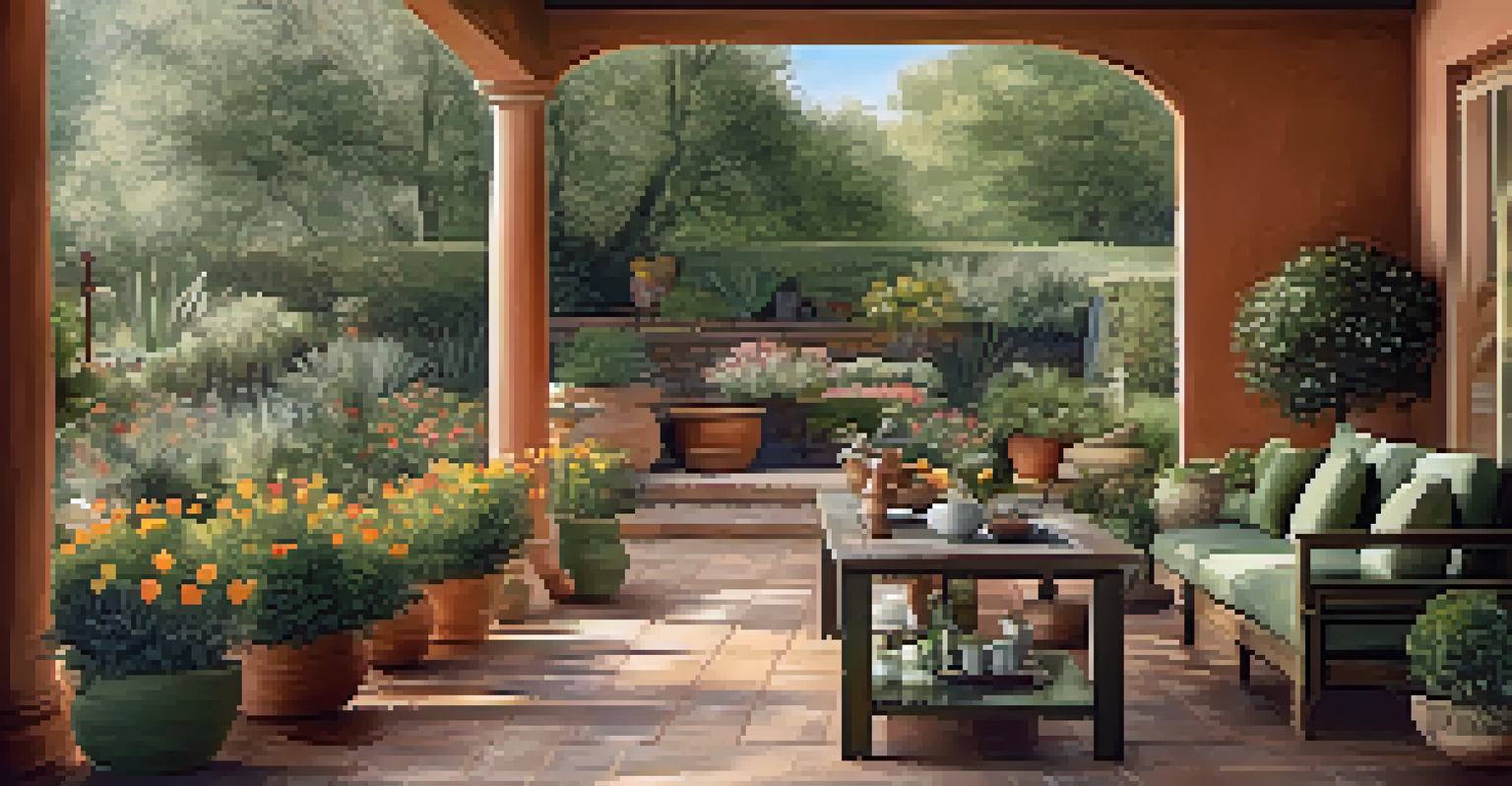
Incorporating Nature-Inspired Color Schemes
Nature offers an endless source of inspiration for outdoor color schemes. By drawing from the surrounding environment, you can create a space that feels connected to the outdoors. Colors found in plants, flowers, and natural materials can inform your palette, ensuring that your design feels harmonious with nature.
For instance, using shades of green and brown can mimic the look of a lush garden, creating a tranquil escape. These colors not only provide a calming effect but also blend seamlessly with the landscape, making the outdoor space feel like a natural extension of your home.
Additionally, incorporating colors inspired by seasonal changes can keep your outdoor area feeling fresh and exciting. For example, warm oranges and reds in the fall can create a cozy atmosphere, while bright greens and yellows in spring can invigorate your space. This approach ensures that your outdoor design evolves with the seasons.
Tips for Choosing the Right Color Scheme
Choosing the right color scheme for your outdoor space can feel overwhelming, but a few tips can simplify the process. Start by considering the existing elements in your space, such as siding, paths, and plants. These can serve as a foundation and guide the color choices you make.
Next, think about the mood you want to create. Do you want a vibrant, energetic space for entertaining, or a serene oasis for relaxation? Identifying your goals can help narrow down your color palette and ensure that your choices align with your vision.
Nature-Inspired Color Choices
Incorporating colors from nature creates a harmonious outdoor space that feels connected to its environment.
Lastly, don’t hesitate to test colors before committing. Using paint samples or fabric swatches can help you visualize how different hues interact with each other in natural light. This step can prevent costly mistakes and ensure you’re happy with your final choices.
Maintaining Your Outdoor Color Schemes
Once you've established a beautiful color scheme for your outdoor space, it's essential to maintain it. Regular cleaning of outdoor furniture and surfaces helps keep colors vibrant and prevents fading caused by the elements. It's also a good idea to apply protective coatings to painted surfaces to extend their lifespan.
Seasonal maintenance is another key aspect. As seasons change, so do the colors in your outdoor area. Regularly rotating accessories, such as cushions or planters, can keep the space feeling fresh and aligned with the current season's palette.
Finally, consider refreshing your color scheme every few years. This doesn't mean a complete overhaul but rather adding new accent colors or swapping out faded items. This simple act can breathe new life into your outdoor space and keep it looking modern and inviting.