The Role of Color Psychology in Home Renovation Design

What is Color Psychology and Why Does It Matter?
Color psychology is the study of how colors affect human emotions and behaviors. In home renovation design, understanding this can make a significant difference in how spaces feel and function. For instance, a soothing blue can promote relaxation, making it ideal for bedrooms or bathrooms.
Color is the keyboard, the eyes are the harmonies, the soul is the piano with many strings.
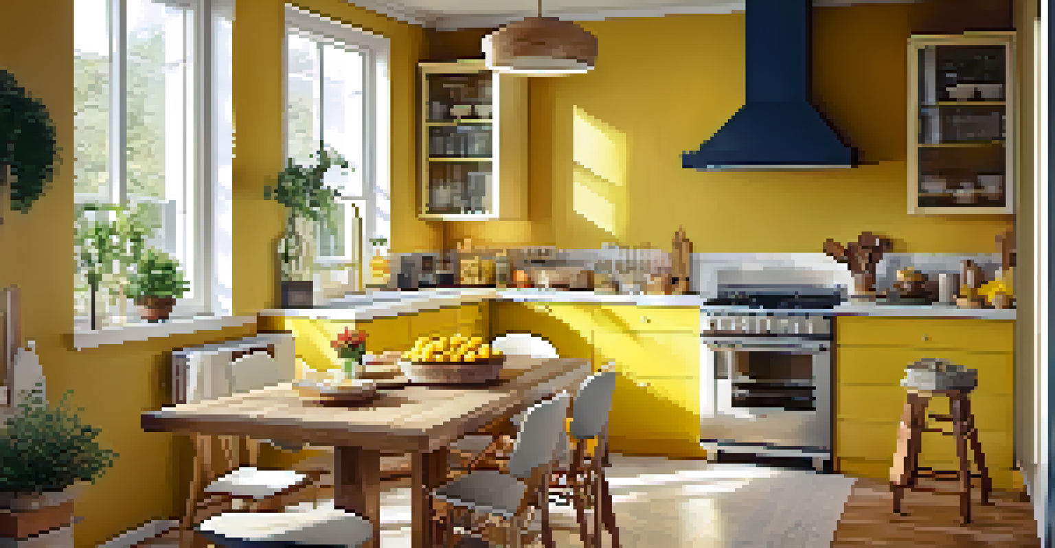
By using color strategically, homeowners can create environments that enhance their well-being. Imagine walking into a vibrant kitchen painted in sunny yellow; it can instantly boost your mood and energy levels. Thus, choosing the right colors is not just about aesthetics; it's about crafting experiences.
Moreover, color choices can influence how we perceive space. Light colors can make a small room appear larger, while darker tones can add warmth and coziness. This interplay of perception and emotion underscores the importance of color psychology in home renovation.
Understanding the Emotional Impact of Different Colors
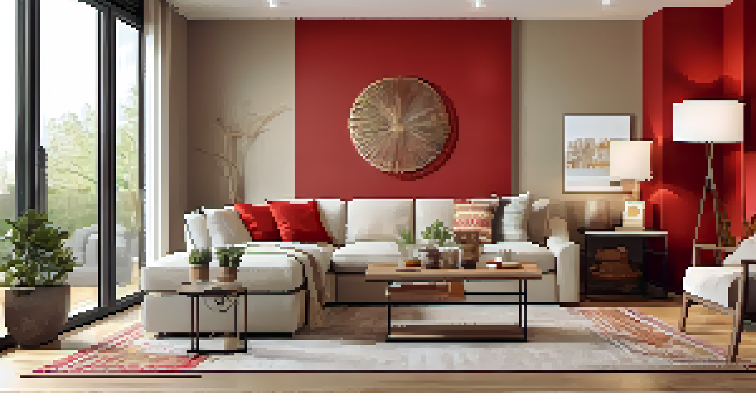
Each color carries its own emotional weight. For instance, red is often associated with passion and energy, but it can also evoke feelings of anger. In a living room, a splash of red might stimulate conversation, while too much could lead to tension.
On the other hand, greens and blues are known for their calming effects. They can create a serene atmosphere, perfect for spaces meant for relaxation, like a reading nook or a bedroom. A well-placed green plant can also enhance this effect, connecting the indoors with nature.
Colors Influence Emotions
Understanding color psychology helps create spaces that enhance well-being and evoke desired emotions.
It's essential to consider how these colors interact with the purpose of each room. When renovating, think about the emotions you want to evoke in each space and choose colors accordingly to enhance those feelings.
Choosing Colors for Different Rooms in Your Home
When it comes to choosing colors for different rooms, context is key. For example, kitchens often benefit from warm colors like yellows and oranges that stimulate appetite and conversation. This makes them ideal for family gatherings and mealtime.
Colors are the smiles of nature.
Bathrooms, however, may call for cooler colors like soft blues or aquas that promote tranquility and cleanliness. Picture a spa-like retreat where you can unwind after a long day—color plays a huge role in achieving that ambiance.
Living rooms can be more versatile; a neutral base allows for accent colors that reflect your personality. You might choose a bold accent wall to create a focal point, while keeping the rest of the room subdued for balance.
The Influence of Light on Color Perception
Light can dramatically change how we perceive color, making it a crucial factor in home renovation design. Natural light often brings out the true essence of colors, while artificial lighting can alter their appearance. A bright, sunny room may make a pale yellow appear vibrant, while the same shade might look drab under fluorescent lights.
It's important to consider the lighting in your space when choosing colors. Test paint swatches in different lighting conditions throughout the day to see how they change. This can help you avoid unpleasant surprises once the renovation is complete.
Lighting Affects Color Perception
The way light interacts with colors can dramatically change their appearance, making it vital to test colors in different lighting conditions.
Additionally, the direction of light can also impact color perception. North-facing rooms may benefit from warmer tones to counterbalance the cooler light, while south-facing rooms can handle cooler shades that bring out their brightness.
Balancing Bold and Neutral Colors in Design
Finding the right balance between bold and neutral colors is essential in home renovation. Bold colors can add personality and vibrancy, but too much can become overwhelming. Think of a bold red accent wall paired with soft beige furnishings—this combination creates a striking yet comfortable space.
Neutral colors serve as a calming backdrop, allowing bold colors to shine without taking over. They can also help in creating a cohesive look throughout your home, ensuring that different rooms feel connected. Consider a palette of grays and whites, accented with colorful decor pieces.
Ultimately, the key is moderation. Use bold colors in smaller doses, such as through accessories or furniture, while keeping larger surfaces like walls and floors in neutral tones. This approach allows for flexibility in your design as trends and tastes evolve.
Creating a Cohesive Color Palette for Your Home
A cohesive color palette can transform your home into a harmonious space. Start by choosing a primary color that reflects your style, then select complementary colors that enhance it. This method ensures that each room feels connected while still allowing for individual expression.
Consider using tools like color wheels or online design apps to visualize how different shades work together. For instance, if you choose a soft blue for the living room, a deeper navy for an adjacent dining room can create a sophisticated flow.
Balance Bold and Neutral Colors
Successfully combining bold and neutral colors can add personality to a space while maintaining a cohesive and comfortable environment.
Remember, the goal is to create a narrative throughout your home. Each color choice should contribute to the overall story you want to tell, whether it’s calming, energetic, or inviting.
Tips for Testing Colors Before Committing
Before fully committing to a color, testing it in your space is crucial. Paint small sections of your walls and observe how the colors change throughout the day. This practice helps you see the color in various lighting and provides a more accurate representation of how it will look long-term.
You can also incorporate fabric swatches, furniture pieces, or decor items in your test area to see how everything works together. Sometimes, the colors you think will look great might not mesh well with your existing elements.
Lastly, don’t rush the process. Take your time to explore different shades and combinations until you find the perfect fit. After all, home renovation is an investment in your happiness and comfort.